Your Legal Resource
Tarocchi Di Guppemberg 1840
1995 limited edition by Il Meneghello,
reproduction of Gumppenberg�s c.1840 Lombardi deck
This is a facsimile edition of a c.1840 deck by the Milanese card maker Ferdinando Gumppenberg. Gumppenberg produced several different decks in the early to mid-1800s, including Della Rocca's beautifully engraved Lombardi Tarot (Soprafino Tarot).
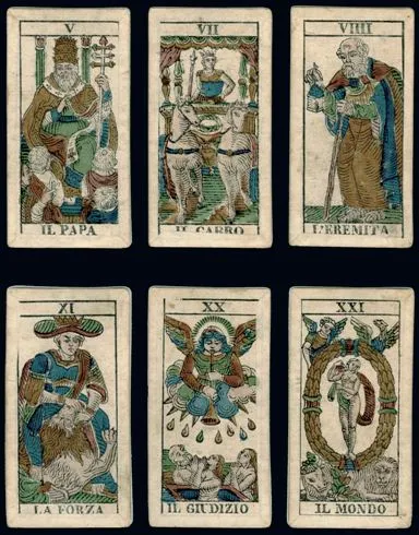
This reproduction was printed in 1995 by Il Meneghello as a limited edition. The original deck was woodblock printed in black and painted (probably using stencils) with six colors. I like the color tones used because I think they are very friendly and earthy. The specks and inconsistencies of the original paper are captured as well but are cleaned up on all the edges of this deck, outside of the black borders. The break where these specks stop is barely noticeable though, adding a nice effect as opposed to being distracting. The cards are also laminated. To my mind, this deck looks like it falls stylistically between more crudely designed decks such as early Marseilles decks and more refined (and probably more expensive) decks such as the Soprafino and decks emulating the Soprafino such as those by Teodoro Dotti. Because of the slightly crude stenciling of this deck, I imagine that it was more affordable and intended for wide and popular use.
When I opened this deck, I found that I liked the artwork more than I thought I would, given its somewhat crude execution. The figures, and especially the faces, are actually very well drawn and quite expressive. The Papess, for example, has a nonchalant expression on her face, almost a smirk, and freely opens to us her Book of Wisdom without pretense. The fool is very lovable I think, unlike many renditions of him in other decks; and his little dog too, looking playful and curious, could be Dorothy's Toto causing trouble behind our backs and then jumping out of the bike's basket to escape unseen. The Lovers card actually made me think of the scene in the Godfather, where Michael Corleone is courting Apollonia in 1940's Italy. They take walks on the streets together, always with the elder women trailing as chaperones a few yards behind them.
The Ace of Swords and Batons were very interesting because they reminded me so much of the images in the Waite-Smith deck; this is a feature derived from the earlier Marseilles decks, which this deck borrows from. The King and Queen of Cups really stood out to me as such expressive examples of sensuality and charm. Besides the surprisingly accentuated bosom of the Queen, the way she holds and positions her staff and cup looks very suggestive to me. And the cup that the King is holding or offering is the most male rendering of a feminine symbol that I may have ever seen!
The Knight of Coins has a wonderfully debonair look to him and easily made me think of one of the Three Wise Men bringing the gift of Gold to the Savior child. He also carries two swords yet is not dressed in any sort of armor, unlike the Knight of Swords in this deck who carries only one sword and is definitely armored. Perhaps the Knight of Coin's here is a nineteenth-century James Bond: suave, keen, resourceful yet - like this deck - always ready to poke a little humor at a serious situation.
Review by Mark Filipas, 11/27/99